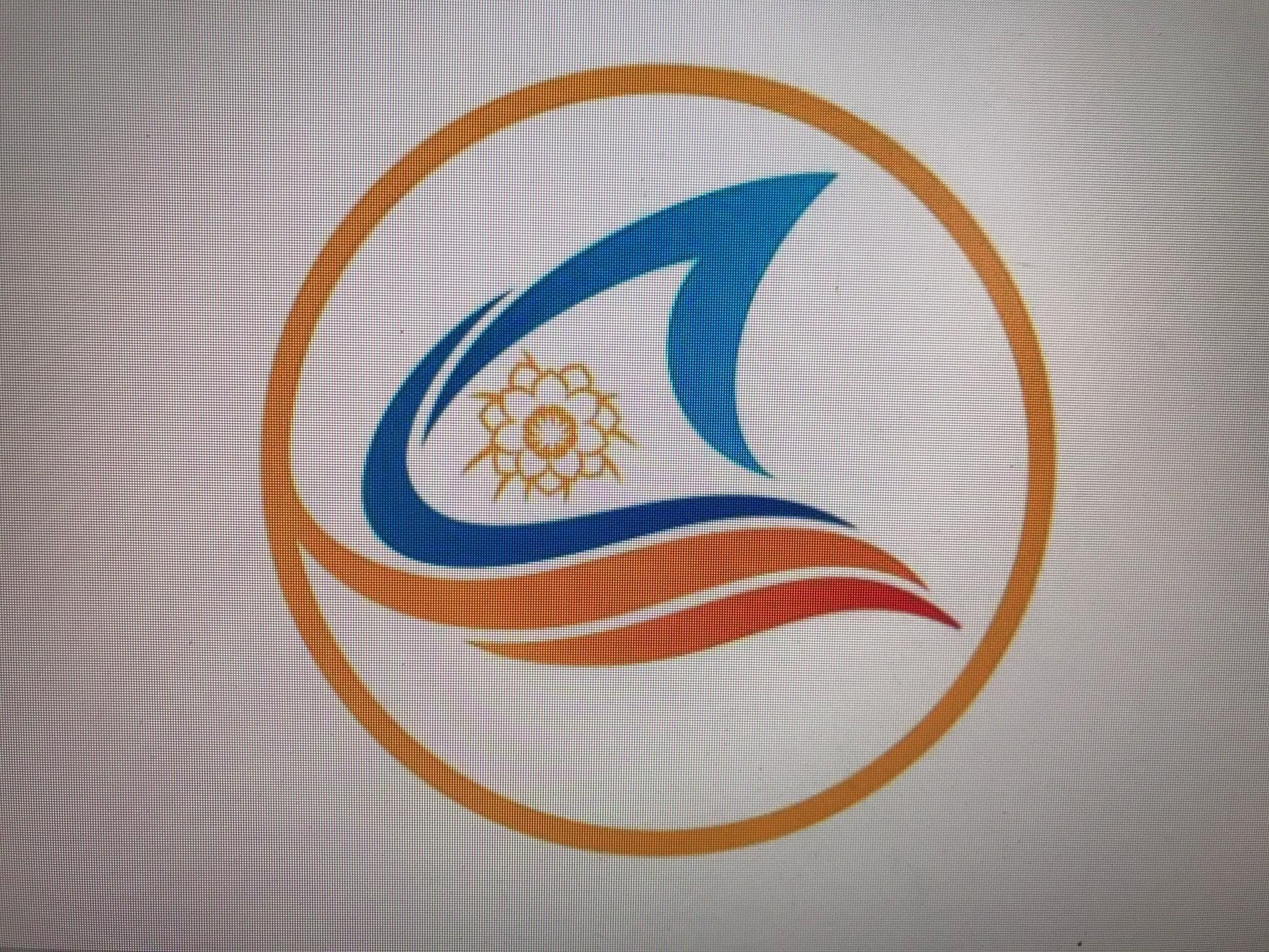
Green Tourism comes together”, using the logo of Binh Thuan tourism.
The logo features some specific images of Binh Thuan province, such as: the the flying peaceful tourism bird , the sand dune, people playing with the waves, a sail in the wind and dragon fruit flower in association with the total solar eclipse event, which occurred in October 24, 1995, marking a milestone in the development of Binh Thuan’s tourism sector. In addition, the logo also represents the solidarity and rythmic connection that reflects the professionalism and development in tourism activities of Binh Thuan province..
The Logo’s overall image symbolizes the thriving tourism industry , with a beautiful ecosystem, hospitable people and speciafic products. The blue color represents a land of wind and sunshine, with blue ocean and fresh weather that is very suitable for water sports-based tourism for domestic and international visitors.
According to the project of hosting National Tourism year 2023 –Binh Thuan -Green Convergence, the logo brings many optimistic meanings. Its appearance is simple but still attractive with high-faluting lines.











.jpg)




.jpeg)
.jpeg)


.jpeg)


